REGISTRATION SYSTEM REDESIGN
LEAD DESIGNER
Multi-platform Design | Complicated User Flow Logic

UX Design | UX Research | User Testing | Design QA
iOS | Android | Desktop Web | Mobile Web | iPad
Duration: 6 months
The Registration system has been one of the most essential parts of Homesnap & Citysnap’s apps and web services across all platforms. Since Homesnap was published in 2015, the registration system has been untouched because of the complicated agent claim and verification process.
In 2021, with the acquisition by Costar Group, Homesnap and Citysnap (the brand specifically for NYC that was reskinned from Homesnap) will need to integrate the Central Auth system (the registration system that Costar Group uses across all companies under it). This is the best chance to update the outdated UI, improve the user experience, and clean the dead-end flows. As the lead designer of this project, I worked closely with my product manager Allison Varnes, software engineers, front-end web developers, and back-end developers.
The feature was launched at the beginning of November 2022, and it helped onboard more than 12k agents by the end of 2022.


Research we conducted throughout this project
- A thorough audit of our current flow
- Existing issues
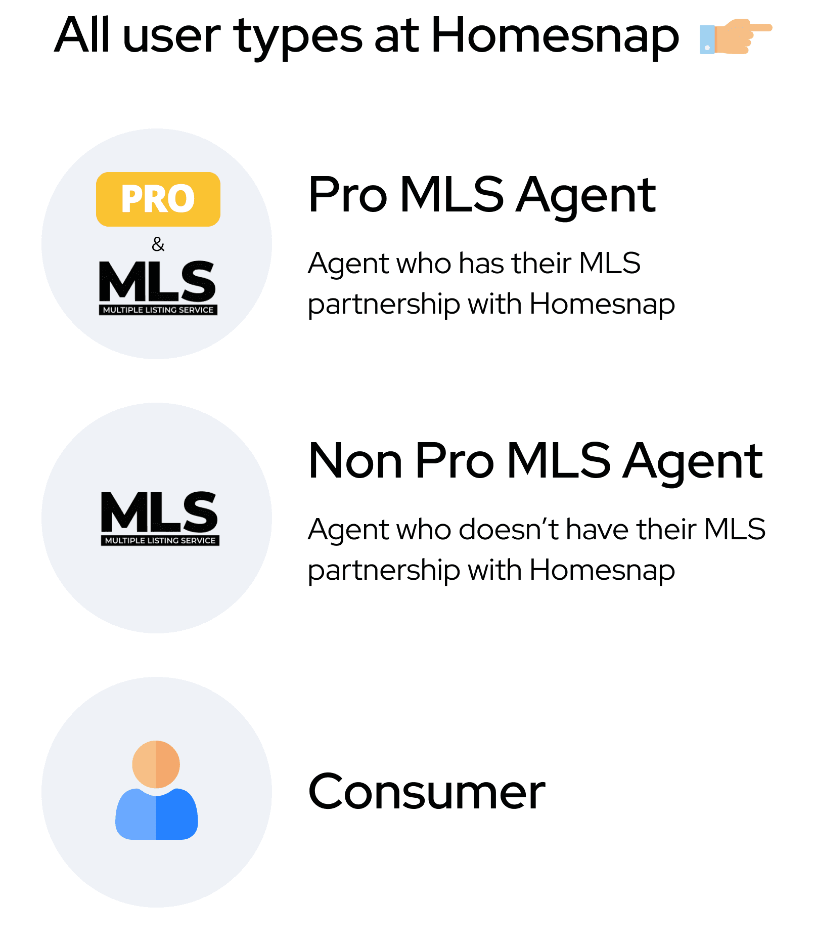
- Differences between each user type’s flows
- UI and flow differences in each platform
- Customer Support Team insights
- Competitive Analysis (i.e. Zillow, Redfin, Trulia, Compass, Keller Williams, Realtor.com, etc…)
Insights from the research
- The users have some confusing and frustrating points
- The current flow has a couple of dead ends in certain edge cases
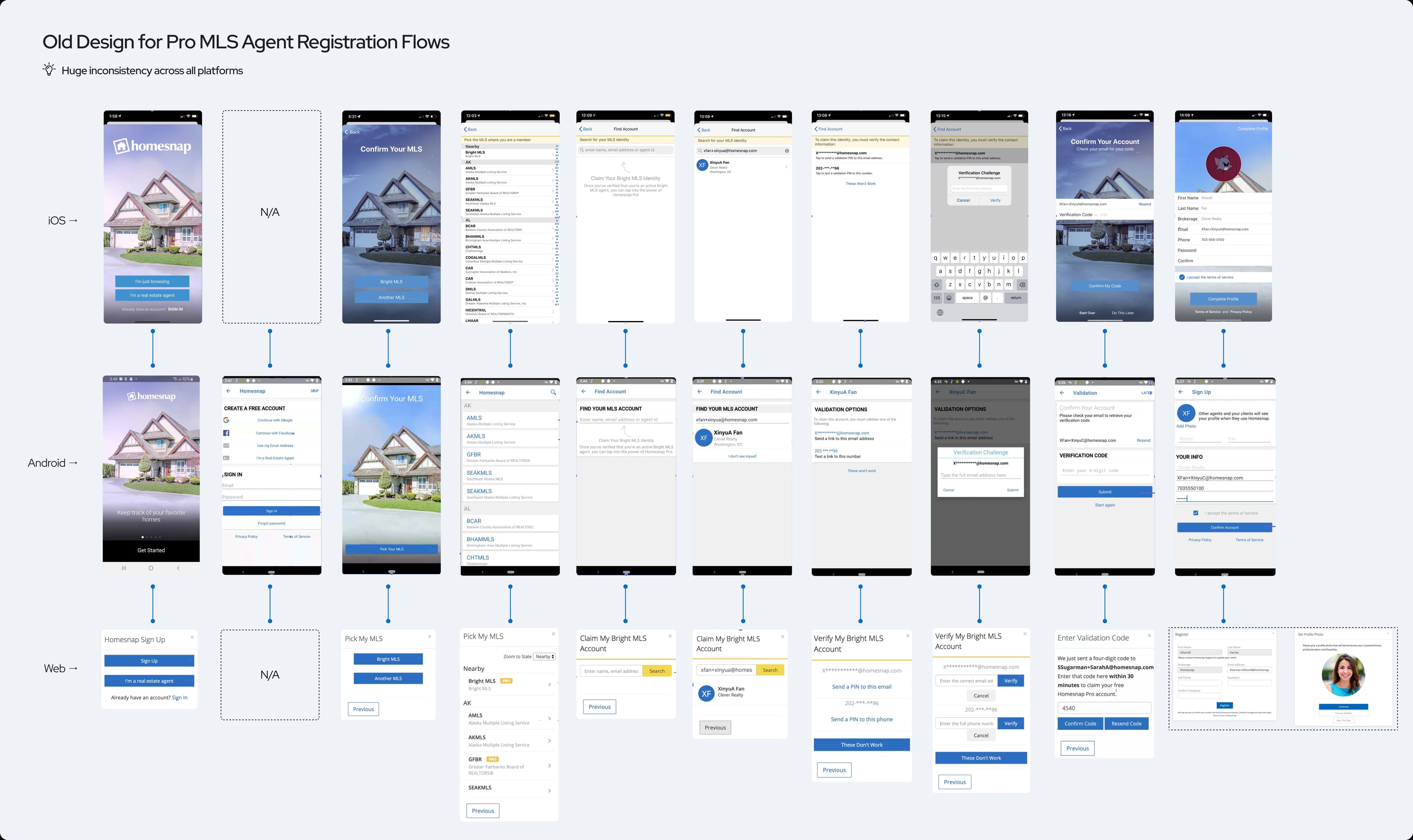
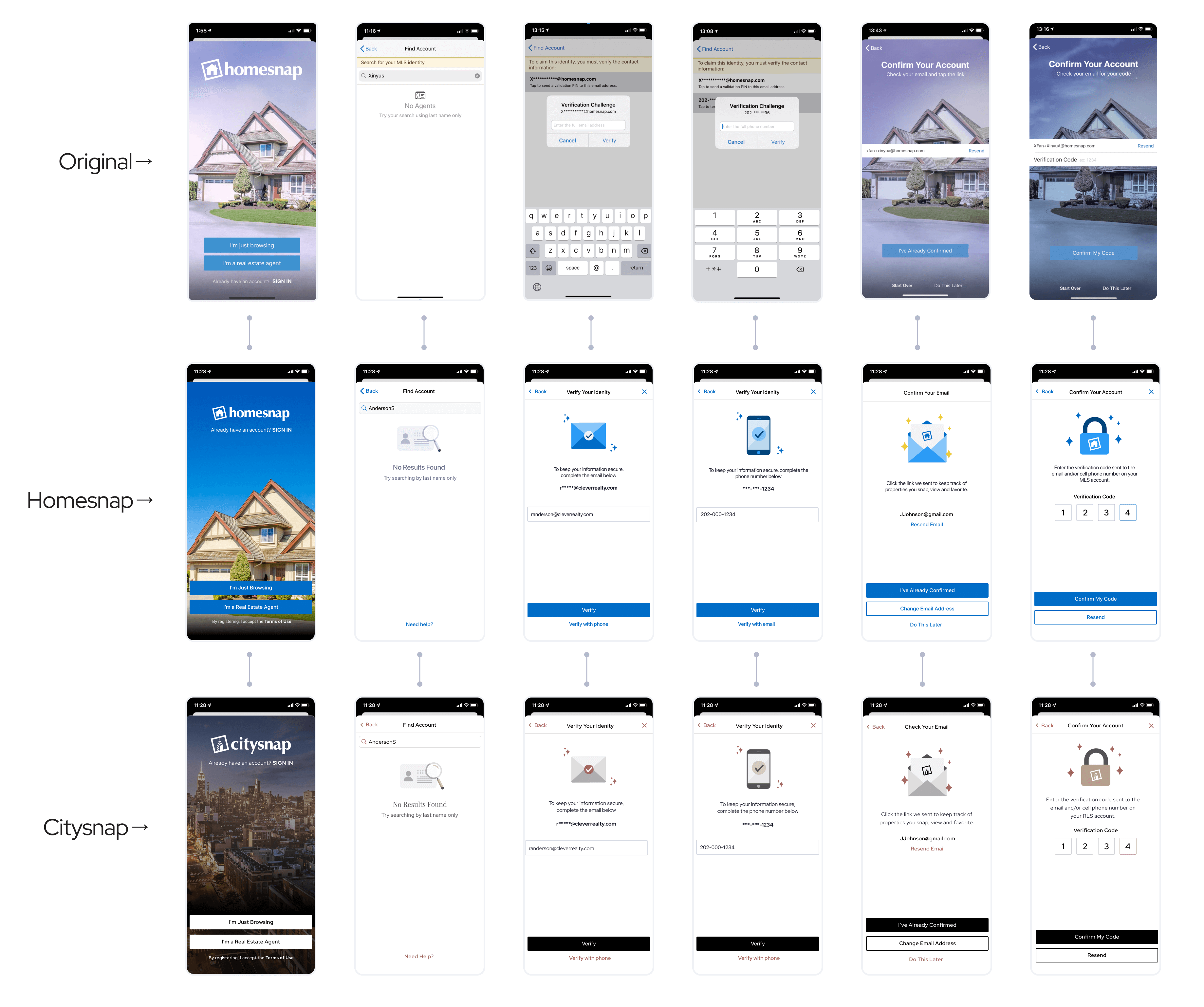
- The current UI is very outdated compared with the other competitors in the market (see the image below)
- The UI and Flow are inconsistent in each platform (see the image below)
- Some users have issues receiving the verification email (this would be a dev issue)


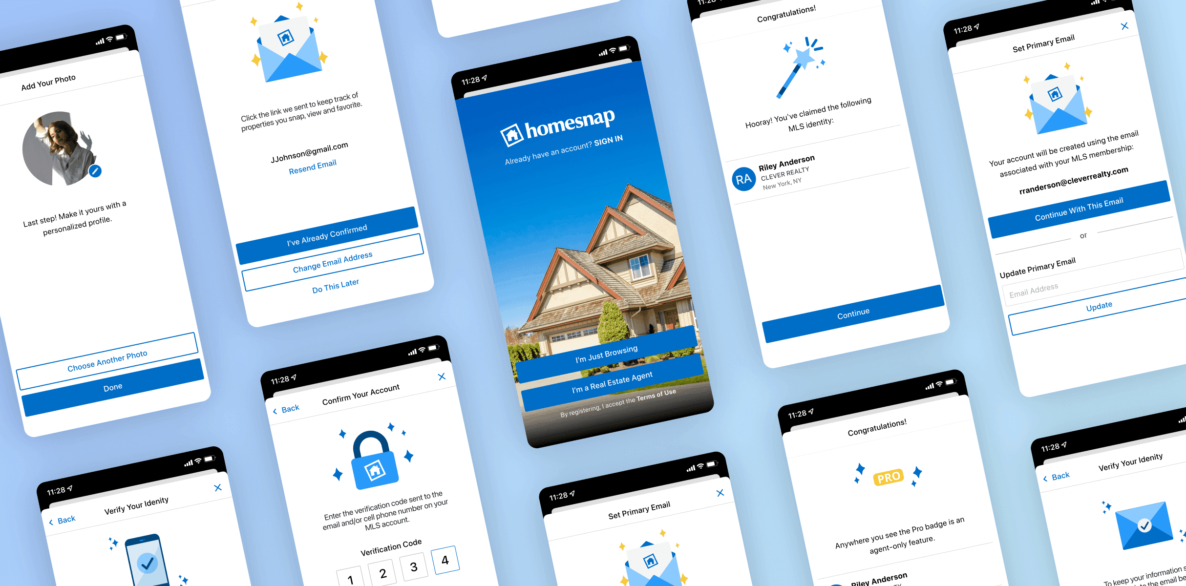
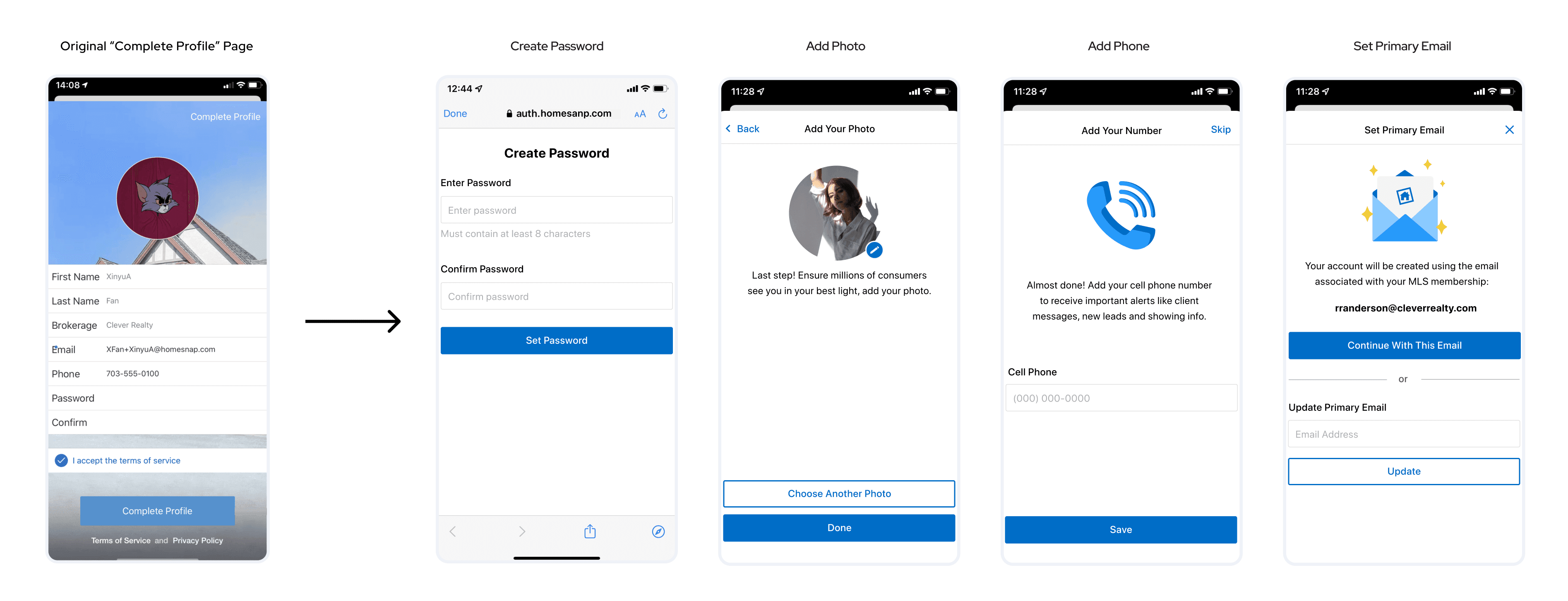
Example: “Complete Profile” flow
In the original design, the information is overloaded on the same page.
- Based on our user research, the user mentioned that they would skip this step without adding a profile picture and phone number because they were hidden in all the columns
- Information like “first name”, “last name”, “brokerage”, and “email” are not able to edit, and putting those on there usually causes confusion to the user.
- Sometimes the agents don’t wish to use their claimed MLS email as the Homesnap login credential, but they cannot change their email for login on this page.
Our solution:
- Removed the unedible information from this step
- Separated the steps into “add photo” and “add phone”, in which we also added the explanatory copy to encourage users to add their profile photo add their phone number
- Introduced the “set primary email” screen so that the user can choose their claimed MLS email or use another email as their login credential
- After we introduce the “central auth” system, the “create password” step would be web-based, which means it would be removed from the native-based “complete profile” page.

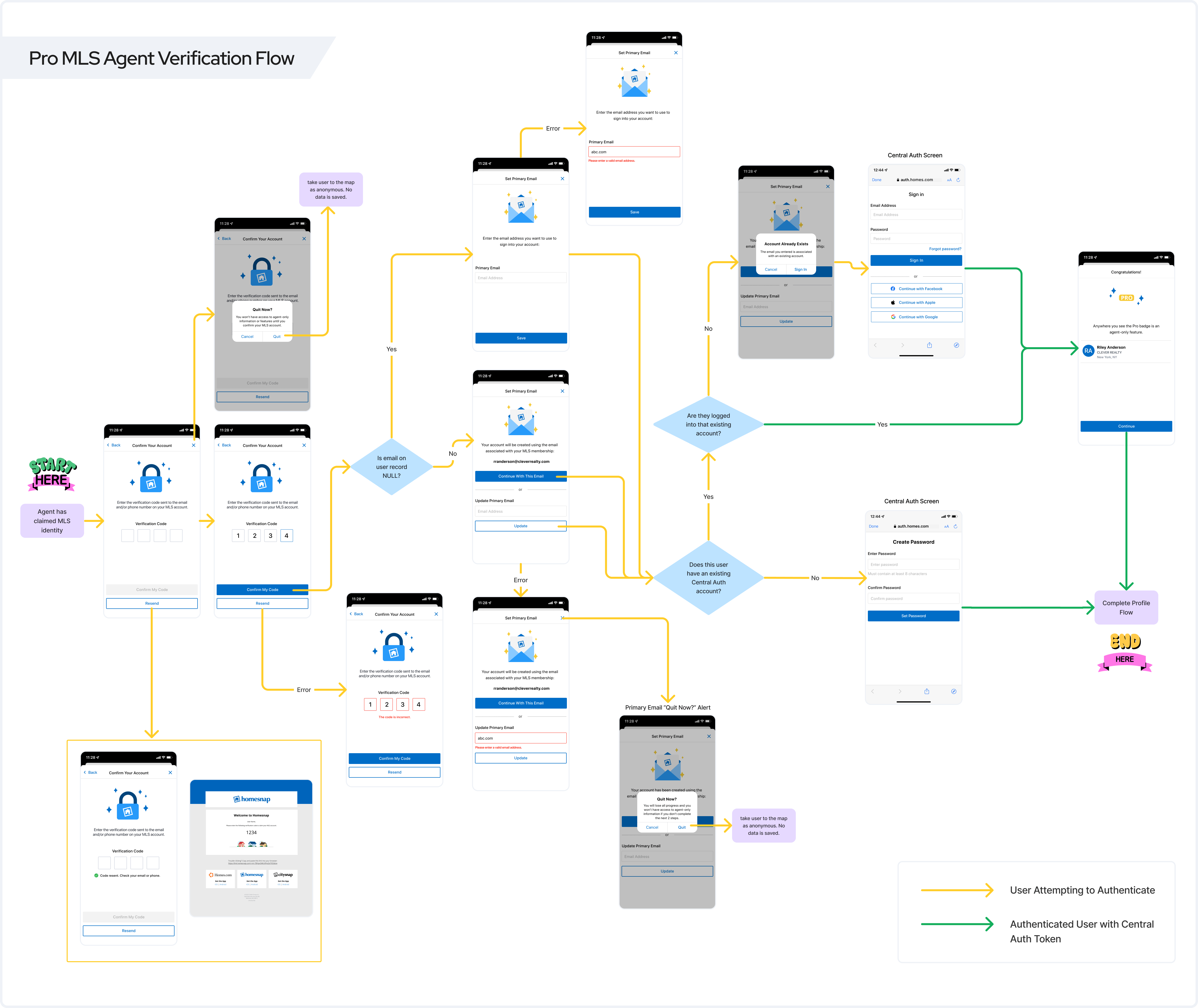
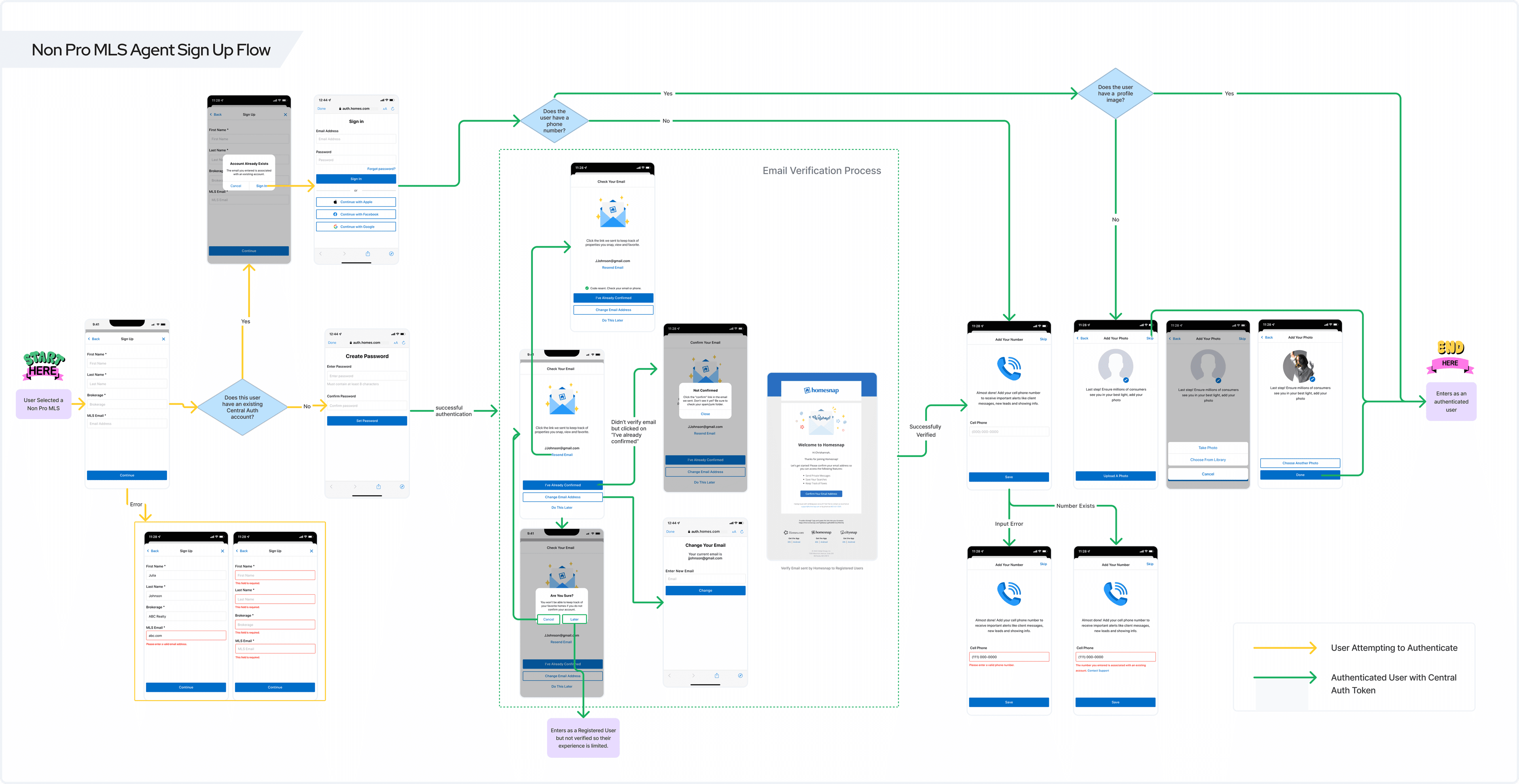
With the introduction of the Central Auth system, the original flow has been changed, which also affected the “happy path” for all user types. With the reimagined logics, we came up with the simplest flows for each user type when they successfully register without meeting any edge case scenarios:


Here are two flows that show all the possible scenarios in the pro-MLS agent verification flow and non-pro MLS agent sign-up flow.

- Created new UI components to improve the visual experience
- Added visuals on each page to better keep the user's attention in the process.
- Made sure all the design components matched with the current design system
- Made sure the design is transferable to Citysnap UI
- Kept the same structure but changed the font and theme color.
- Changed the blue & yellow Homesnap theme color to black & taupe Citysnap theme color
- Made sure the graphics match with Citysnap style
- Kept the same structure but changed the font and theme color.
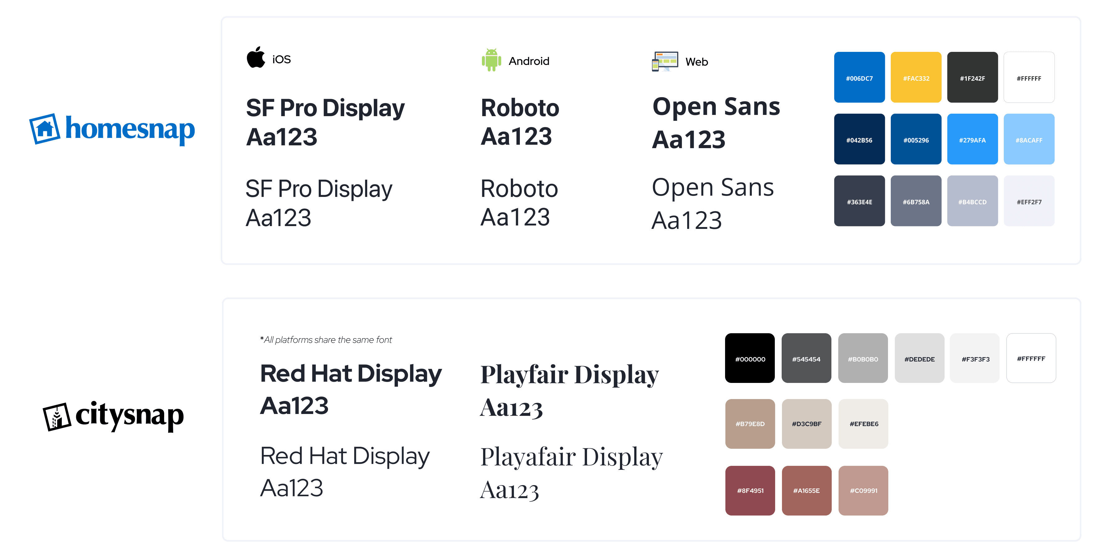
Visual identities for Homesnap and Citysnap
Example: UI design updates for some screens in Homesnap and Citysnap (iOS)

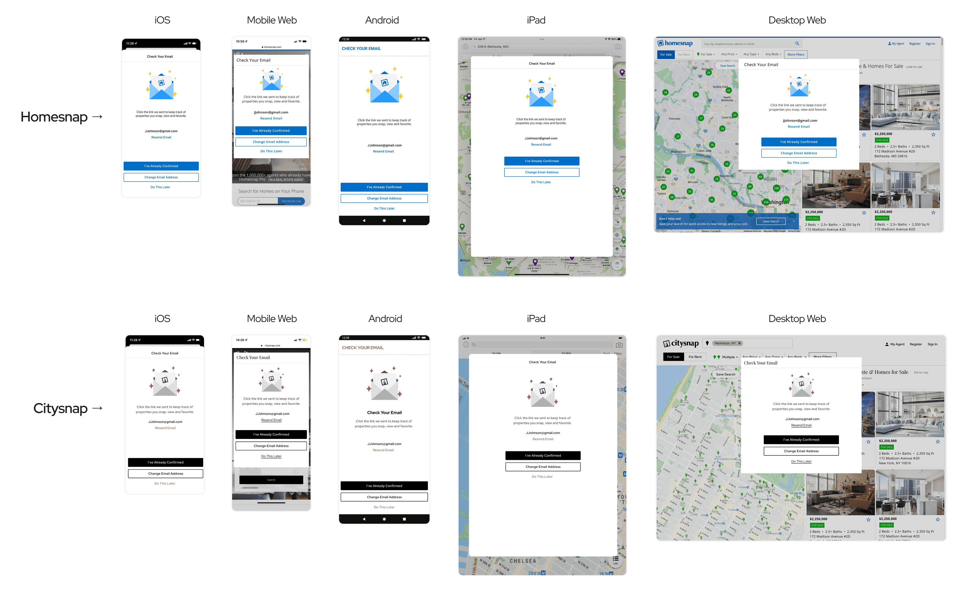
I made designs for iOS, Android, Mobile Web, Desktop Web, and iPad. Here are the examples for the “Check Your Email” screen on all platforms on Homesnap and Citysnap:

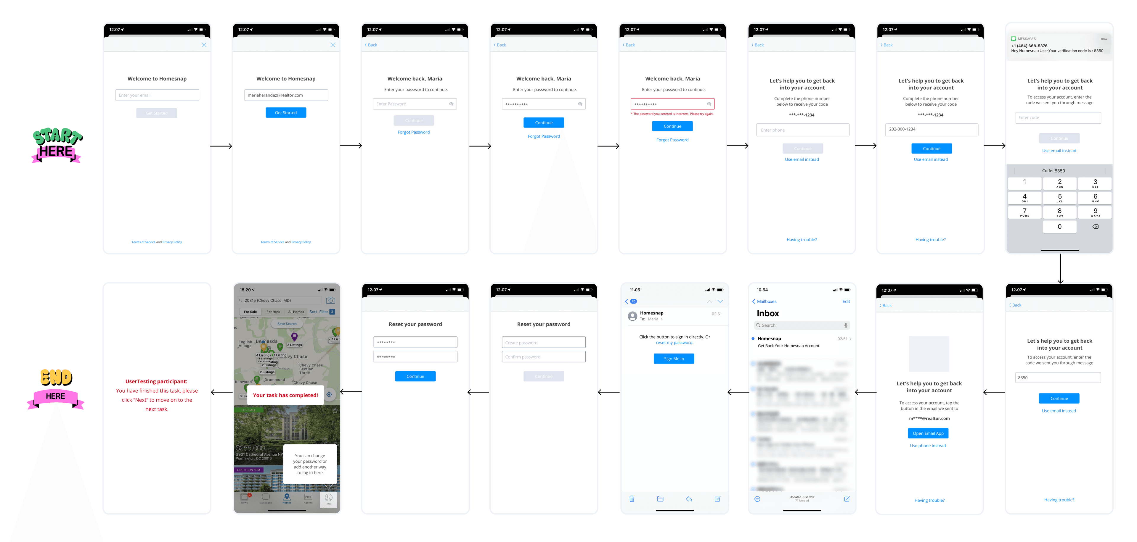
We conducted user tests for 7 flows in total on usertesting.com. We first did it in low fidelity design to get the user's sense. With a couple of revisions based on users’ feedback, we also ended up doing it in high-fidelity design. Here is an example of the user testing screen series (low-fidelity) I prepared:
Final feedbacks we got: