ALL NEW HOMESNAP PRO
LEAD DESIGNER
One of the biggest feature & UI updates for Homesnap
UX Design | UX Research | User Testing | Design QA | Marketing Design
iOS | Android | Desktop Web | Mobile Web | iPad
Duration: 1 year
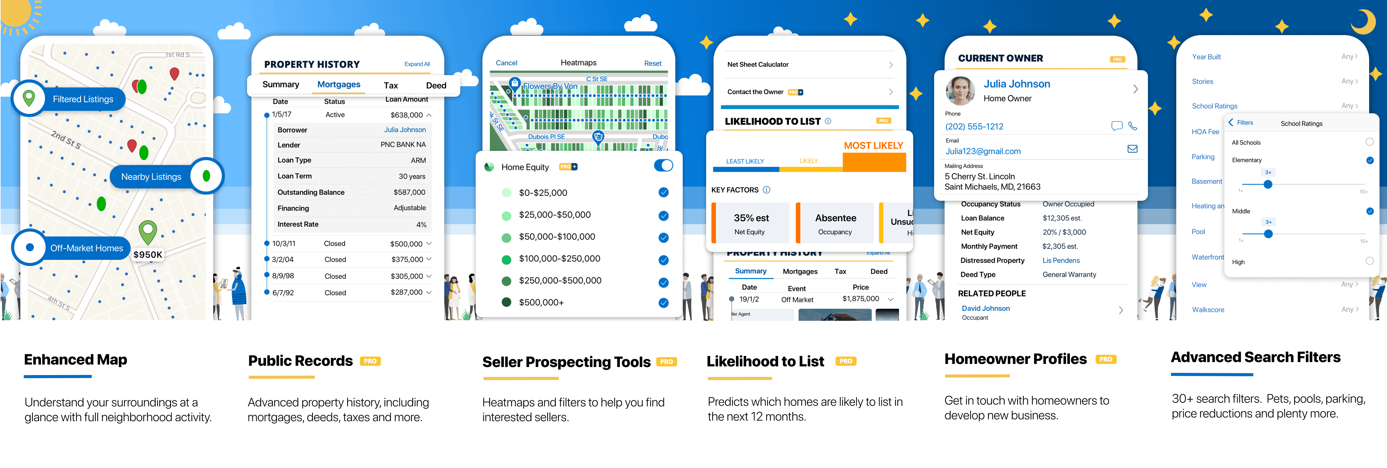
In Feb 2020, Homesnap has introduced All-New Homesnap Pro, the newest and most advanced generation of its home search platform. This new product features a simple, user-friendly interface that empowers agents to dominate their market with extensive property information and the ability to identify potential sellers and homes before the competition. As an advanced generation of Homesnap, it provides real estate professionals with over 500 data sources on a single platform—more than any other mobile solution in residential real estate.
Our main goals for this project were:
- Helping agents find new potential listings by marrying public record data with homeowner identification information.
- Providing a new hero feature to drive Homesnap Pro+ registrations and renewals.
- Gaining feature parity with Remine, our prime competitor in the agent productivity and marketing space.
As the lead designer of this project, starting in early 2019, I redesigned the most prominent core feature of the app with complex data sets providing advanced real estate intelligence info for real estate agent clients. I worked closely with my product manager Josh Tabb and developers across all platforms.
As a result, this product created a 55% increase in user sessions and 23% increase in monthly active users since it launched in Feb 2020.
Feature promotion and introduction on listing / property detail pages

- Add multiple new features into the limited space. Since our listing/property page has been jammed with a lot of content already. How were we able to make sure people use all the new features easily but at the same time not load too much information at first glance?
- Create a proper point of sales to guide users for the Homesnap Pro+ membership purchase. How could we make the user want to click on the CTA? How much information should we show the user as the teaser?
- Create better features and better user experiences than Remine. Since we were going to build a feature that Remine had already published, how could we compete with them?
- Clean up the UI for a consistent style


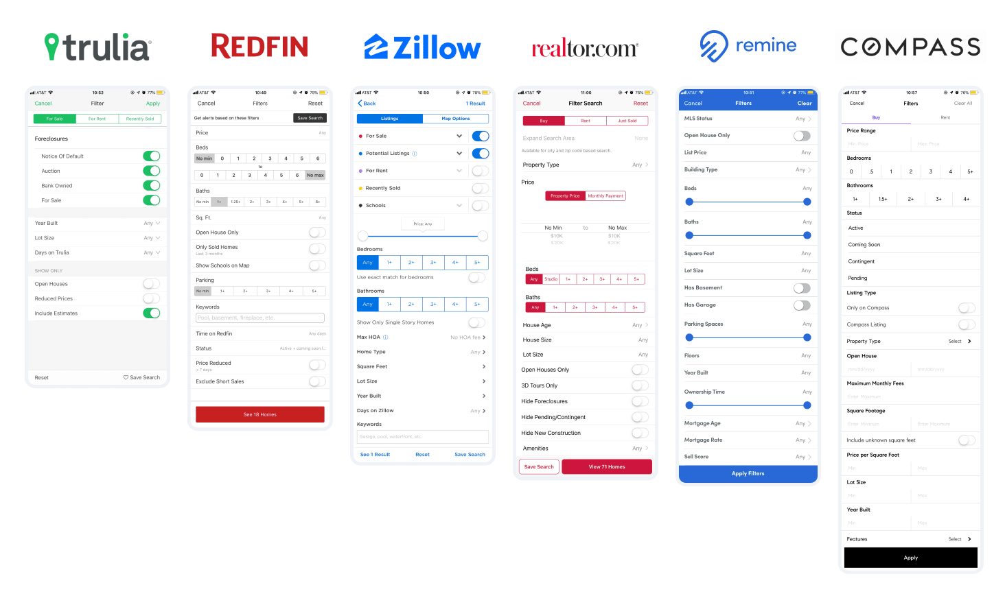
User Interview: 10 real estate agents in total
- Agents would be interested in getting more information about the listing data, including mortgage, deed, and tax information
- For properties that haven’t come into the market, the agents would be interested in seeing the owner’s information and the possible reasons that this property might be listed in the near future
- Agents would want to have more search filter items like the other apps (i.e. Zillow and Redfin)
Competitive Analysis
Example: Advanced Search Filter Update
- Our competitors have more advanced filters than us
- Our UI is outdated comparing the other competitors

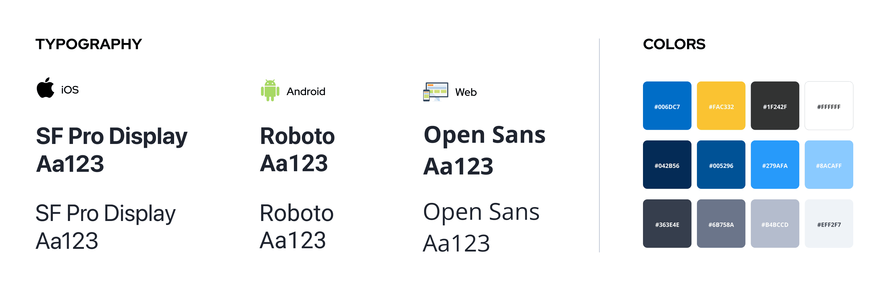
I follow the brand guideline and the design system for all the designs I made. The design system was created during this project, so I also collaborated with the design system manager to add new components into the design system.


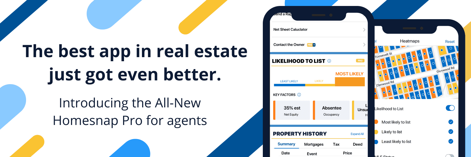
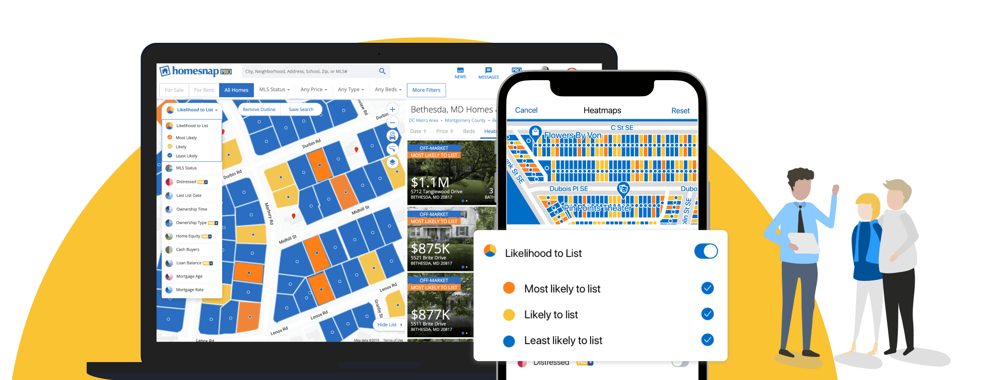
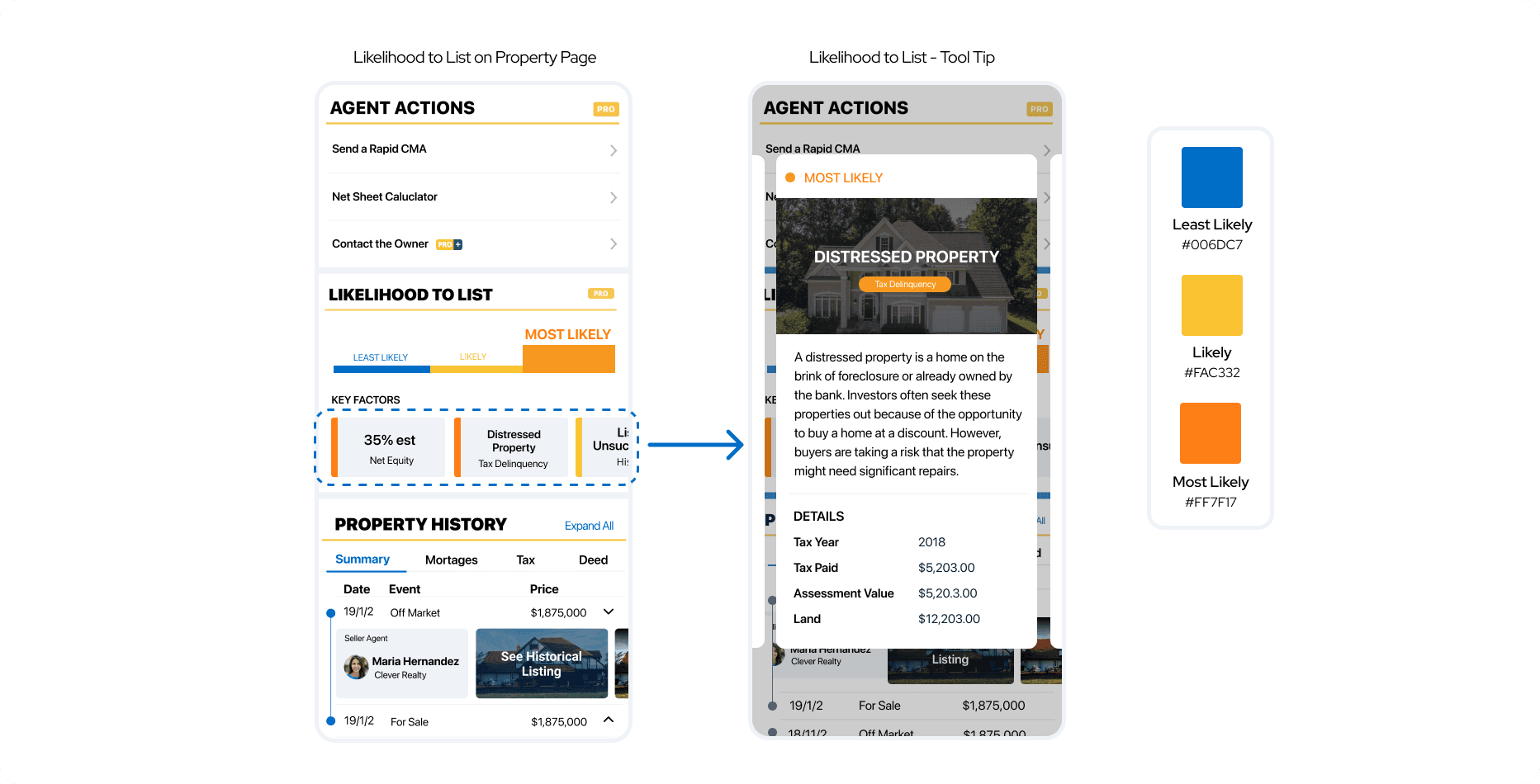
In order to gain feature parity with our main competitor Remine, we purchased data sets from Black Knight (public record data). With the data sets, we created the “Likelihood to List” feature to allow agents to pursue the potential listing. The agents would be able to know how likely a property is going to become a listing based on certain key factors.
UX Challenge
- “Likelihood to List” would be a brand new feature. How should we visualize the complicated machine learning AI algorithms for agents to understand better?
- Where to put the additional data without making the page too long?
UX Solutions
- Created infographic style to show the preference on whether this property would go on the list in the near future. The user can intuitively see whether this listing is likely, least likely, or most likely to go on the market.
- Created horizontally swappable cards to show the related key factors, which gives the user a quick sense of which elements contributed to a certain score. This can also save the vertical space for the page.
- When the user clicks on the key factor cards, the bigger cards would show up and allow the user to see the detail of certain key factors. The cards are swappable horizontally as well, which allows the user to quickly browse the information without additional steps.

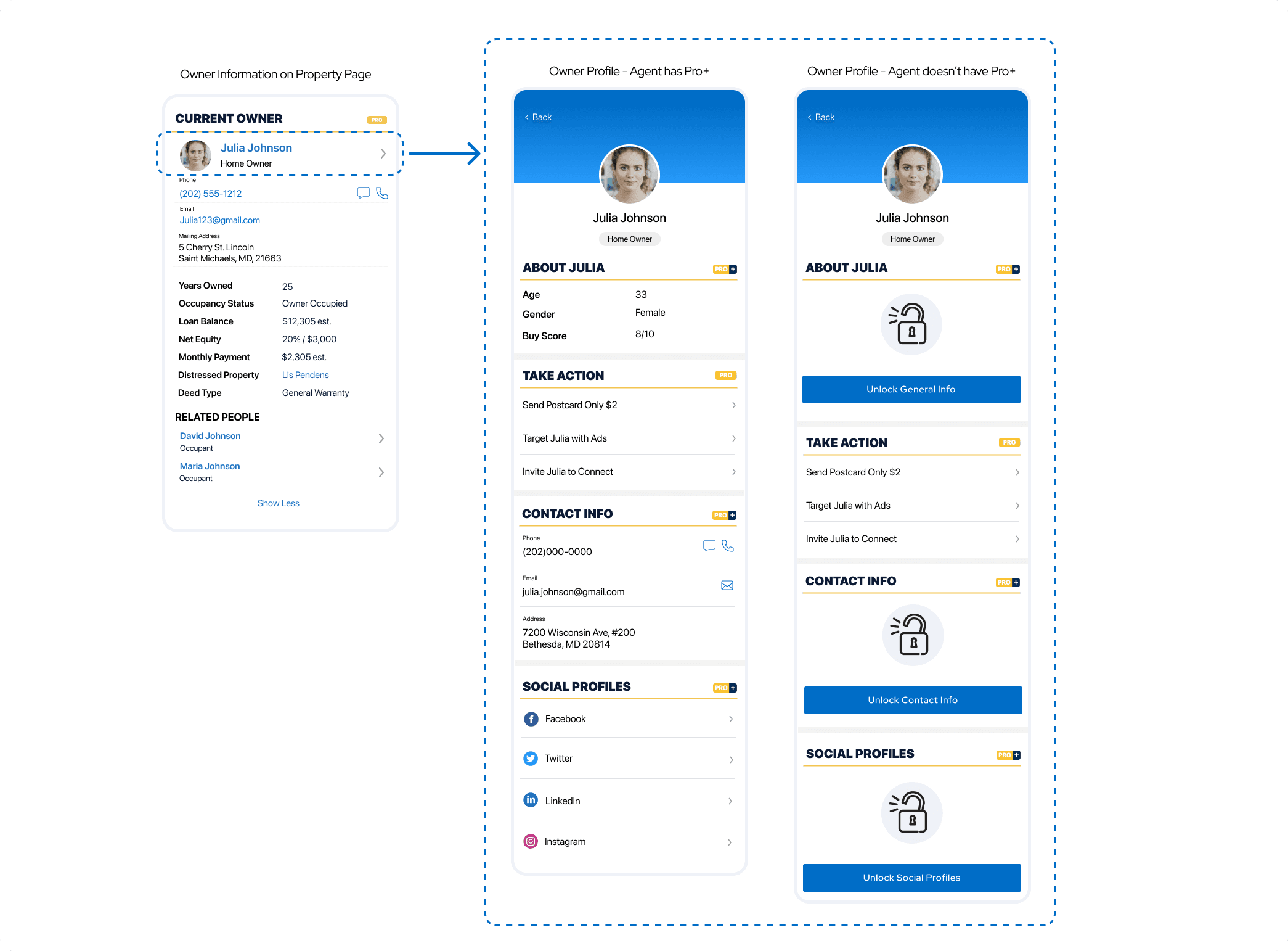
We also purchased data sets from Infutor (identity data) to create the “Owner Information” page to allow the agents better understand the owner of the potential listings.
UX Challenges
- How to put this additional section on the current property page without making the page too long?
- How to make sure the user gets the most important information immediately?
- How to attract users to enter the POS (point of sale) for Homesnap Pro+?
UX Solutions
- Put the primary information on the property page to allow users to have basic but important information.
- By clicking on the chevron next to their name, they can see this owner's detailed information and available actions towards this owner.
- Added a graphic with a CTA for the pro+-only section when a user doesn’t have a Homesnap Pro+ membership yet. When the user clicks on the button, they will be directly led into the Homesnap pro+ POS.

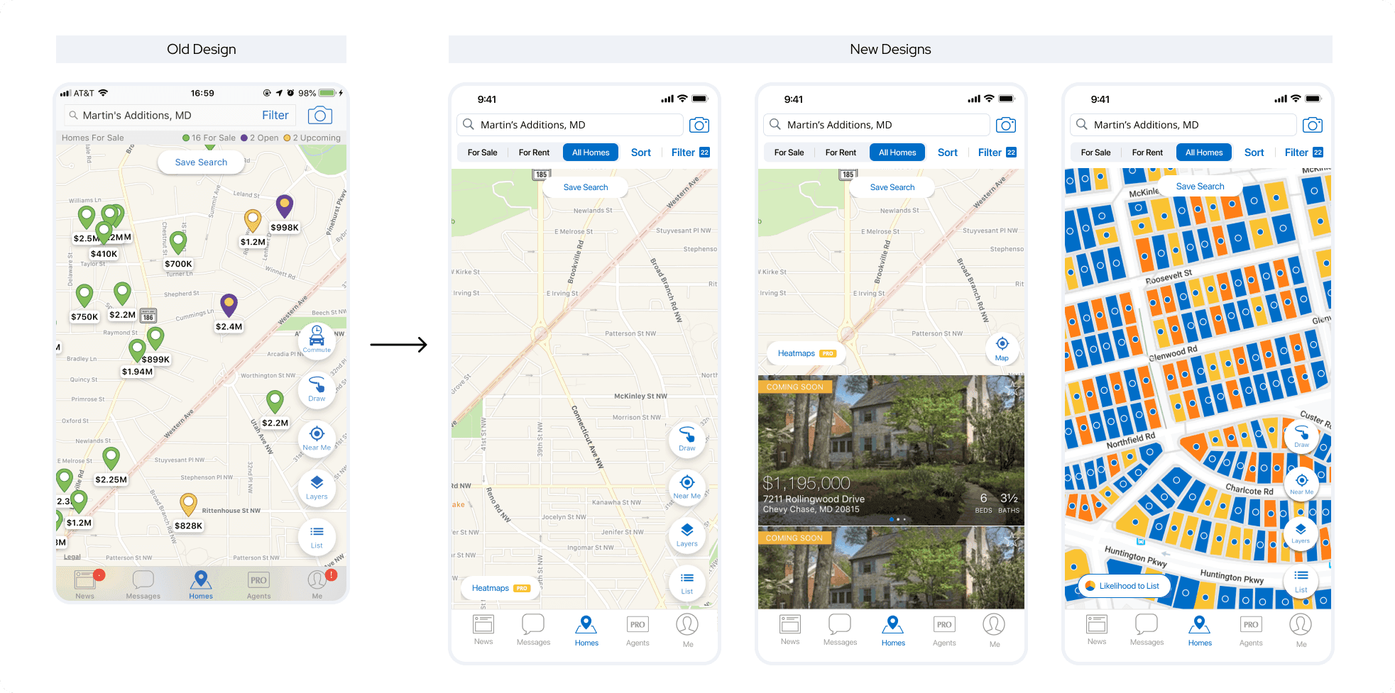
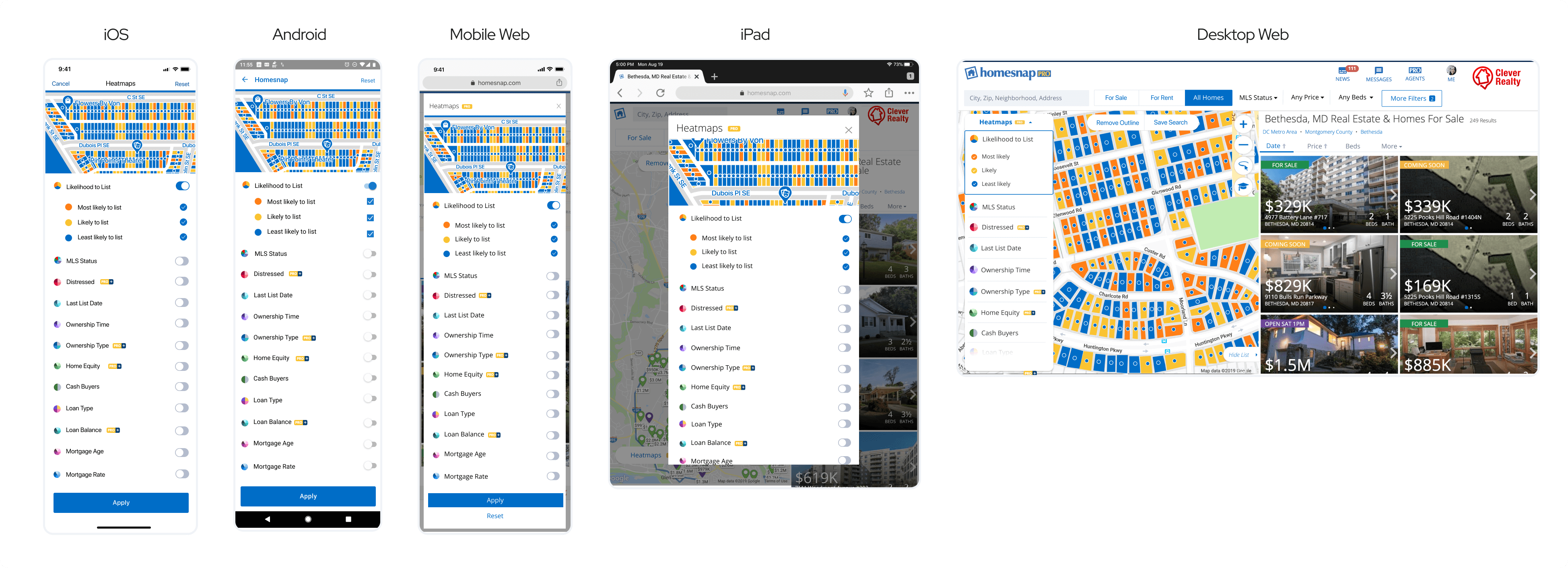
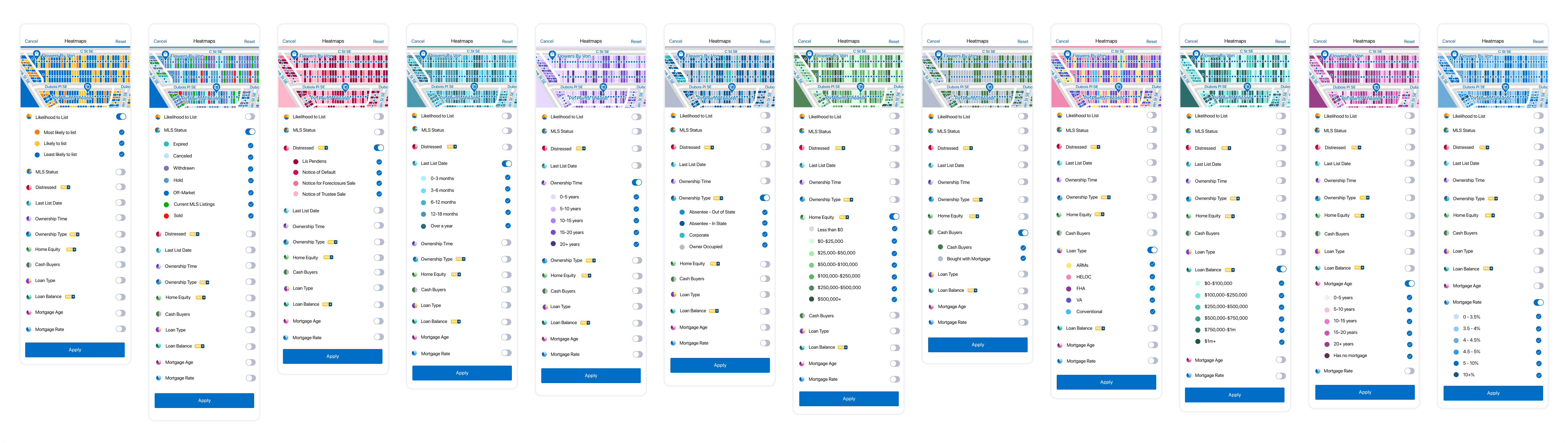
Heatmap is a new feature we created for agents to quickly and easily identify properties that meet their criteria or use filters to find new businesses. We applied the colors to the map to give the agents a better visual so that they could get better insights into the seller leads. This feature is associated with the updates in search filters and the Likelihood to List feature.
UX Challenge
- Where to add this new feature on the current map page?
- The Heatmap feature should only exist in off-market properties, how should we add it without messing up with the existing map for “For Sale” and “For Rent”?
UX Solution
Map Updates
- Created “All Homes” map mode so that the user can see all the off-market properties in this mode.
- Added the “Heatmaps” fab on the map to allow user for easy access to the feature on “All Homes” mode
- Redesigned the map page to allow the user to witch among “For Sale”, “For Rent”, “All Homes” in a better visual style
Heatmap Feature Detail
- Designed the feature on all platforms

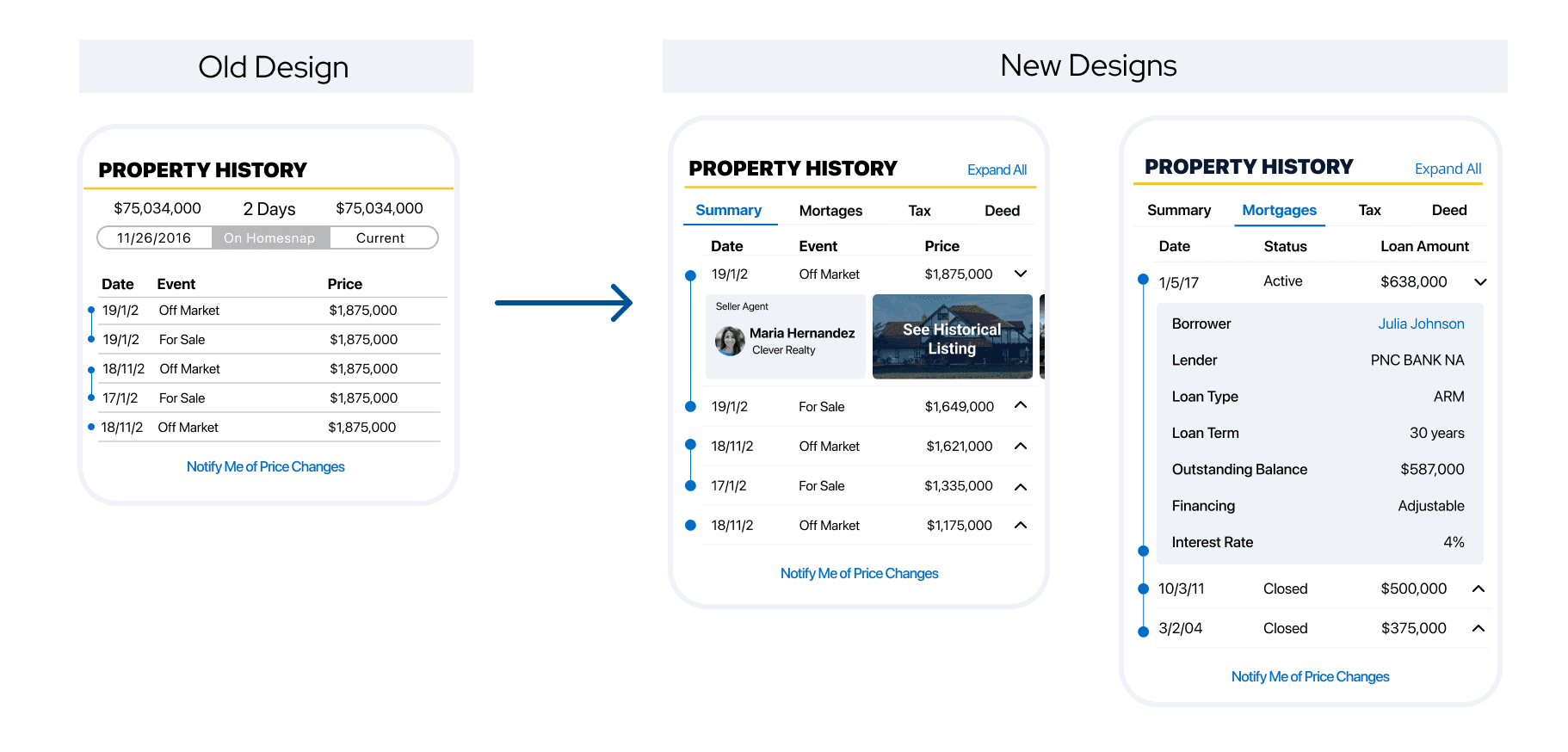
Based on the data sets we purchased from Black Knight and Infutor, and the user research we conducted with the real estate agents, we picked multiple data for Mortage, Tax, and Deed and added them to the original “Property History” section.
UX Challenges
- Outdated UI components need to be updated
- Where to put the additional data (i.e. mortgage, tax, deed information) without making the page too long?
UX Solutions
- Combined similar features into the same section.
- Using tabs to integrate the property history list, mortgage information, tax information, and deed information
- Making the items expandable. For example, in the summary tab, the user can expand the item and see the information about the buyer agent, seller agent, and historical photos.
- The main goal is to keep the design as clean as possible. At the same time, we still want to have the most important information in front of the user.
- Updated the UI components based on the visual guidelines

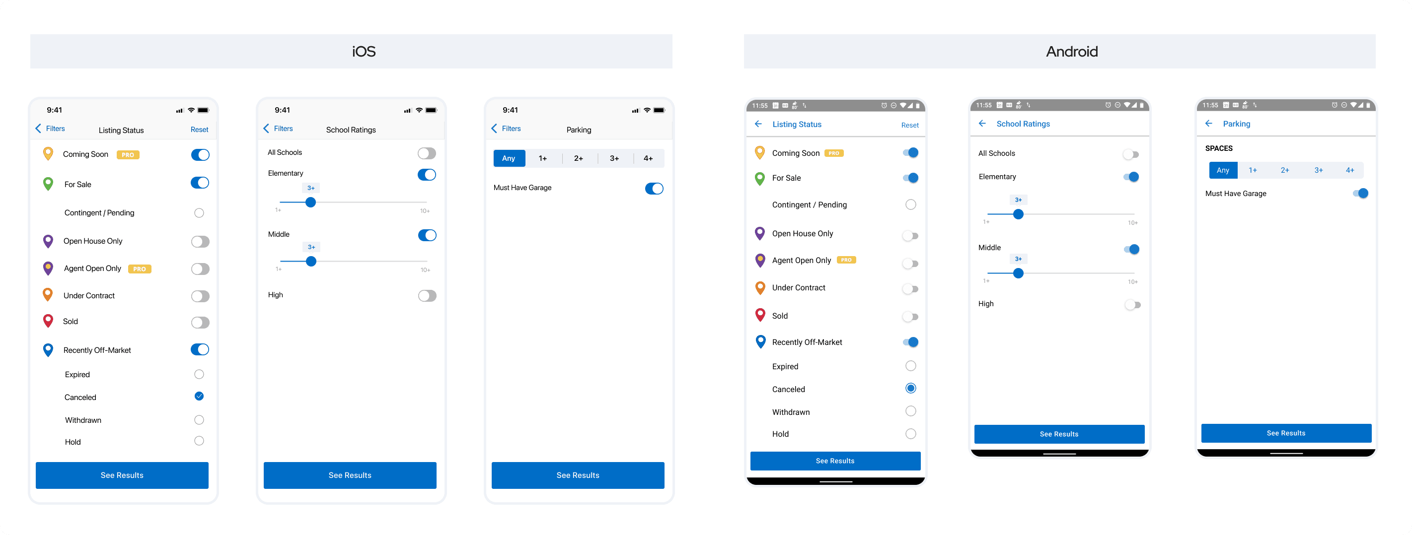
Home search is a core feature of Homesnap. Since agents and consumers are unable to filter by basic parameters, they are utilizing other home search applications, such as Zillow and Redfin, to find properties that meet their criteria. Homesnap’s mobile filter only provides users 35% of options compared to our competitors, Zillow and Redfin, who provide 95% and 65% respectively. Thus, we updated the search feature by combining the quality of MLS data to homebuyers and agents with an increased number of search parameters, which would help Homesnap provide the best in-class home search available in the market.
UX Challenges
- How to add new filters to the existing search filter page and keep it clean?
- How to redesign the whole search filter feature with better visual styles?
- The original search filters only allow system dialog to appear from the bottom. How should we design complicated filter options?
UX Solutions
- Removed the icons for each filter. When there are more than 10 filters on the same page, the icon would make the page visually disturbing, which would hurt the user experience
- Cleaned the UI under the iOS developer and Material Design guidelines
- Removed the elements that were not relevant to this feature. (i.e. camera icon on the top right, bottom navigation)
- Moved the “Reset” text link to the top right, which saved more vertical space for the fixed-position button on the bottom. In this way, the user would be able to see more filters on the page
- Made sure the consistency between the platforms
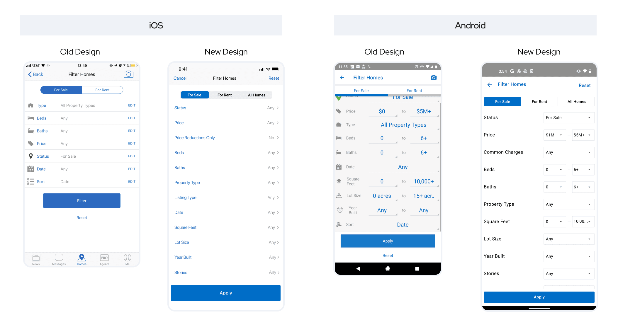
- Since some of the new filters that are more complicated, we introduced additional pages for those filters. The user wouldn’t need to come back to the main page to apply the filter. Instead, they could use “See Results” to apply the filter directly.

During the design process, we did a couple of internal user testings with the in-house real-estate agents. We made iterations based on their feedback. Here are the things we looked at:
- Could find the location of the new features
- Could understand what are the new features about
- Would like to use this feature
- Would like to pay for the usage of this feature
- The whole experience is easy and not confusing


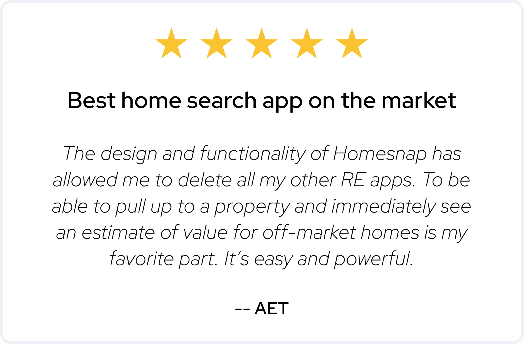
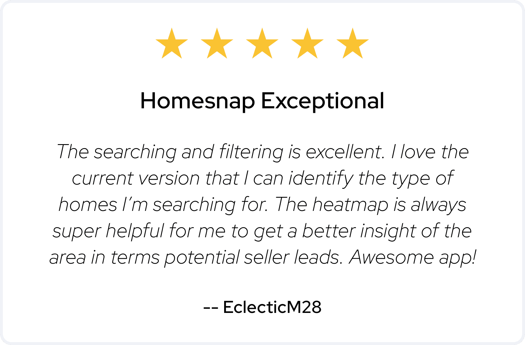
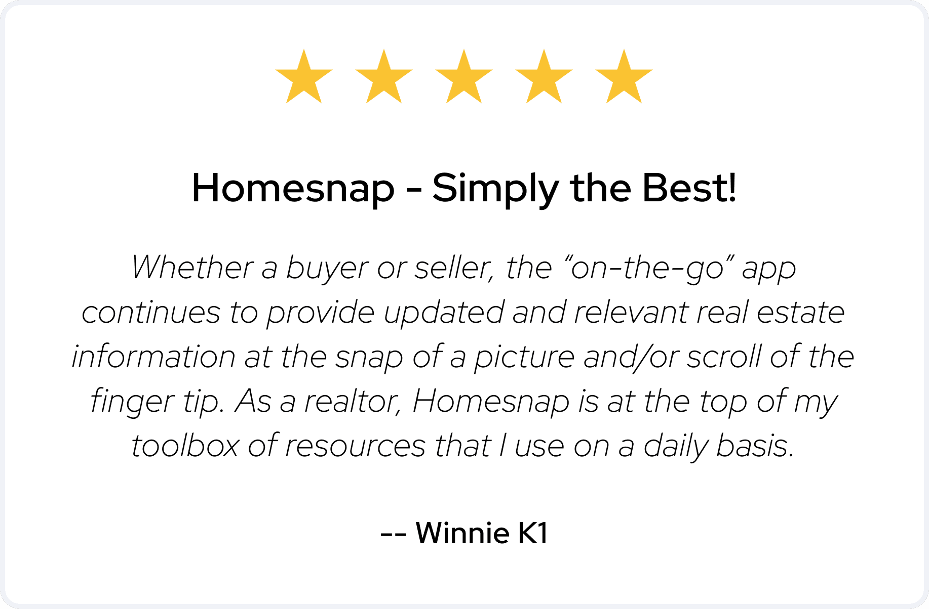
All the comments come from the Appstore review.

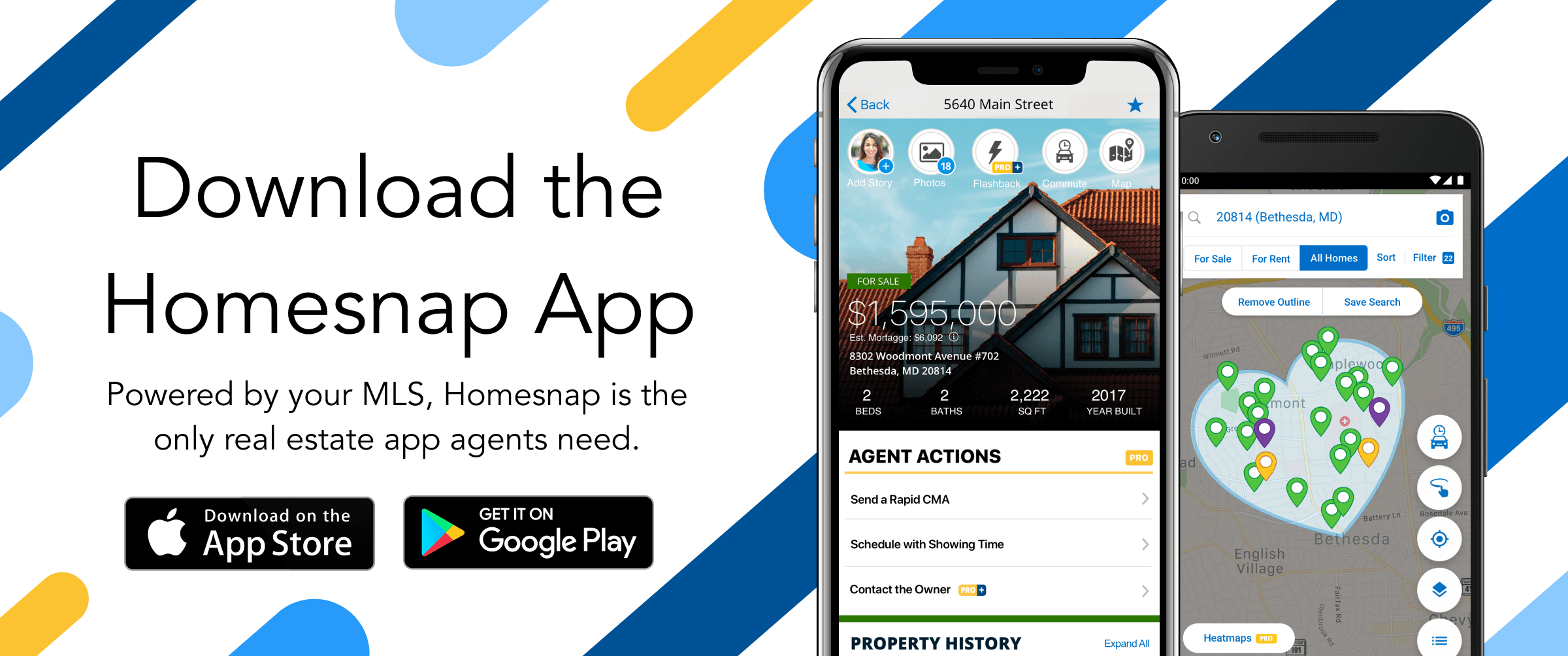
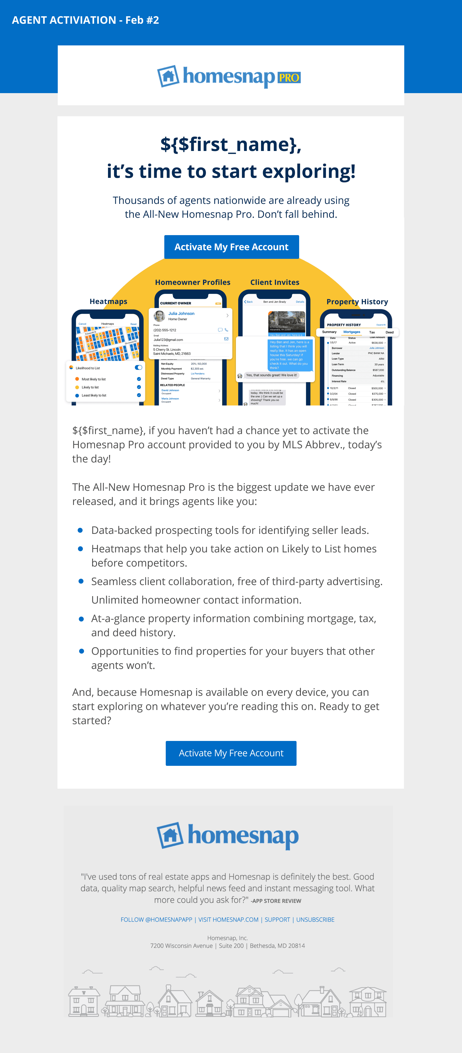
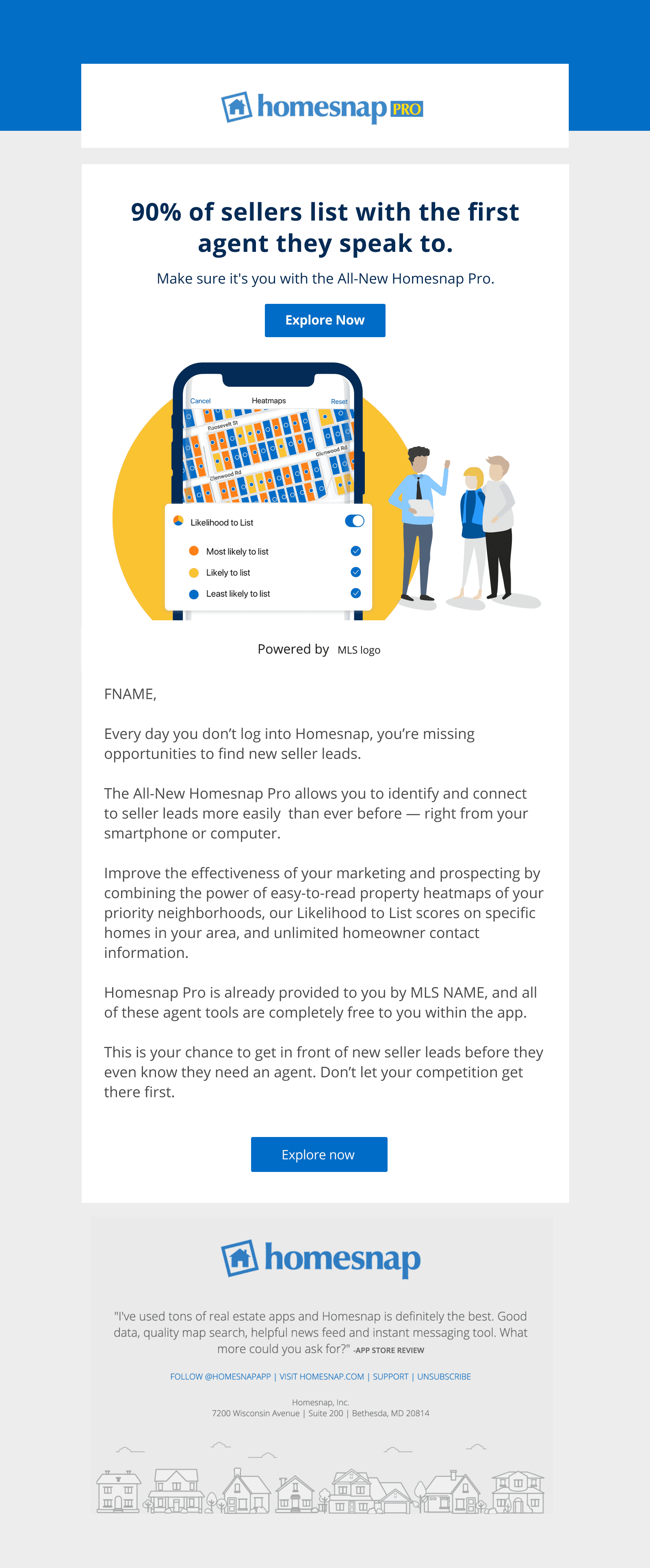
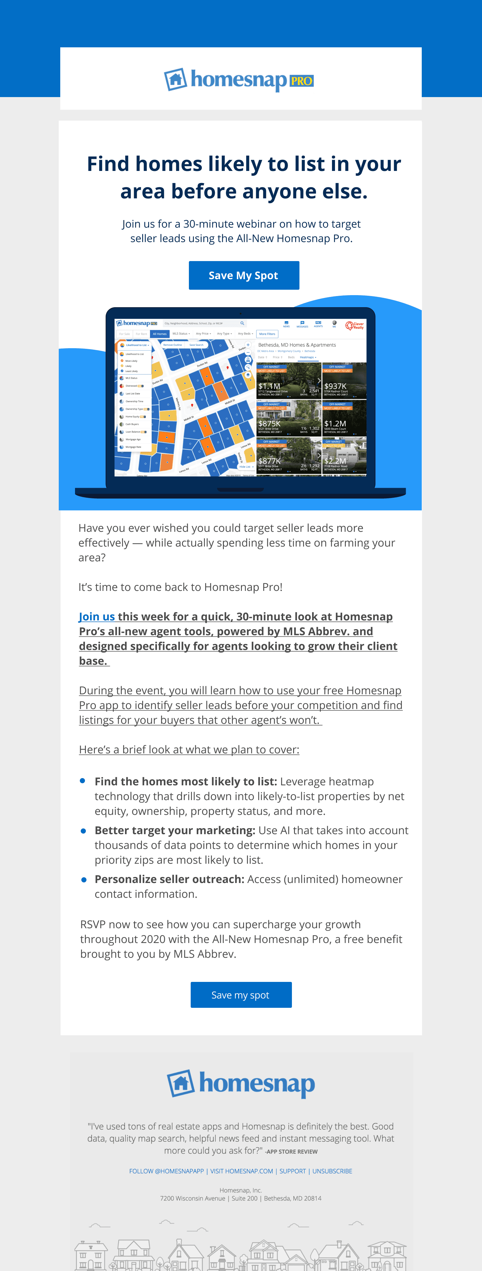
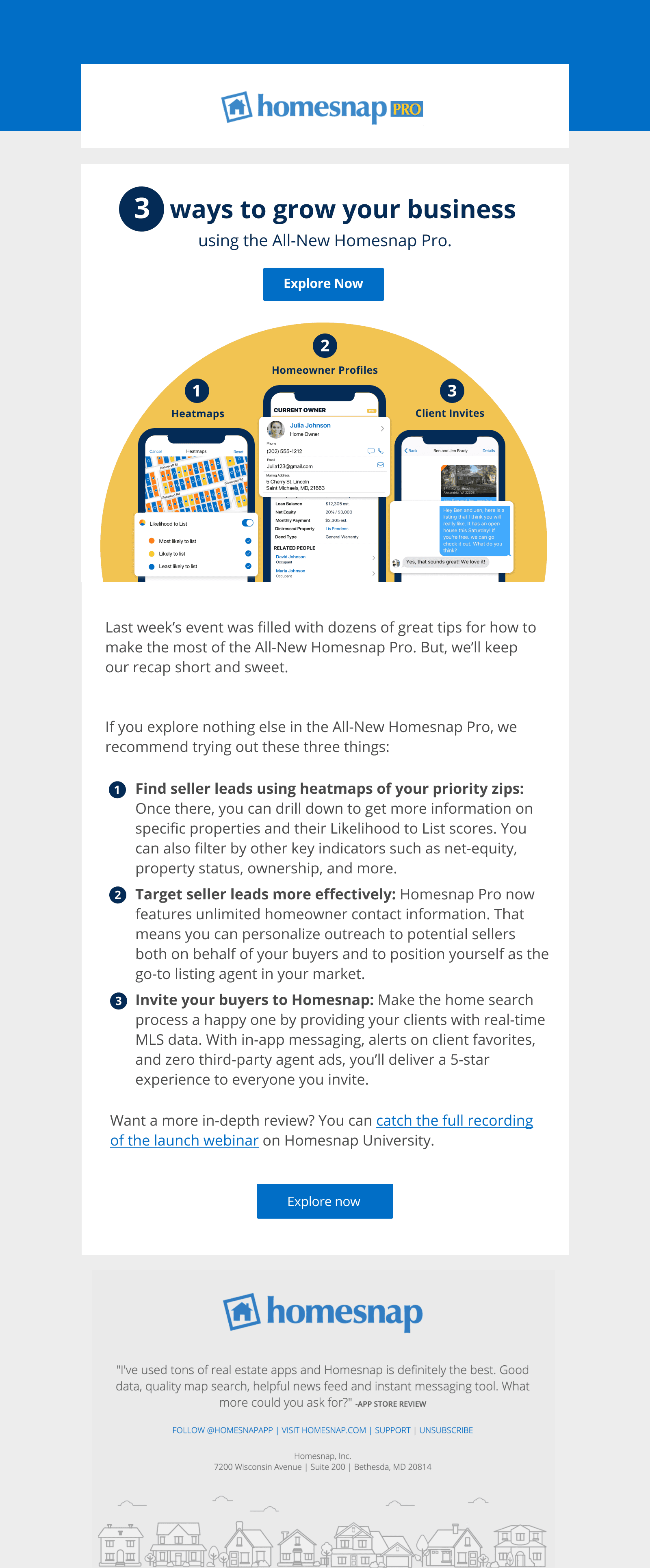
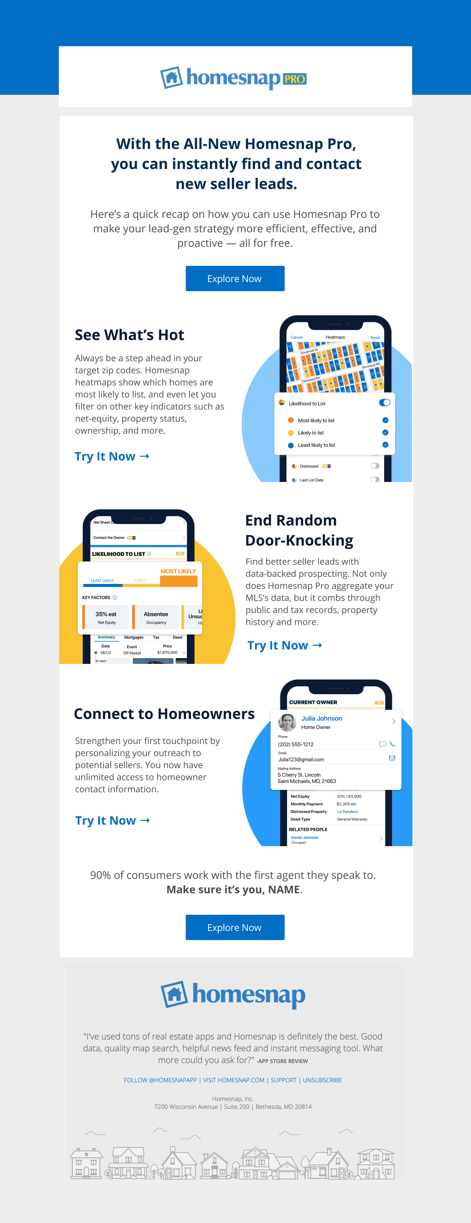
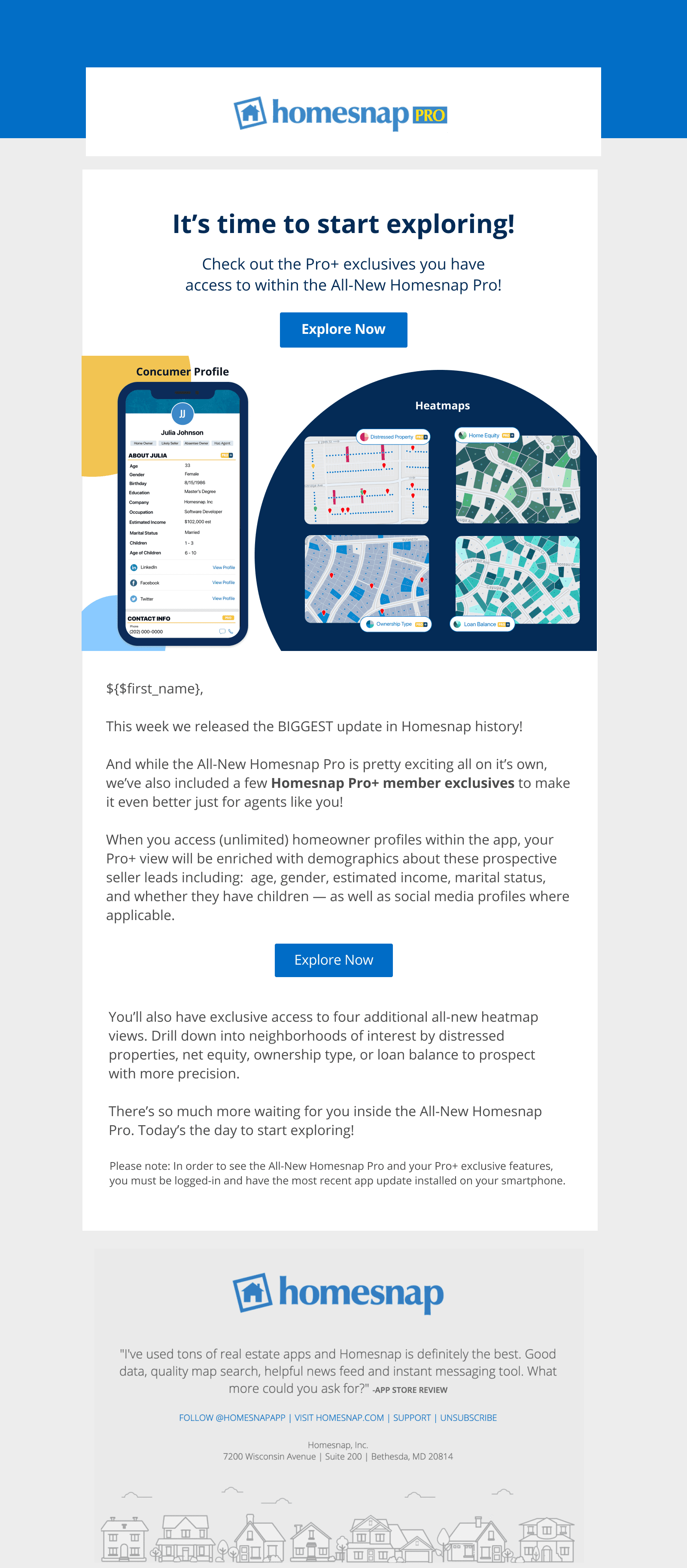
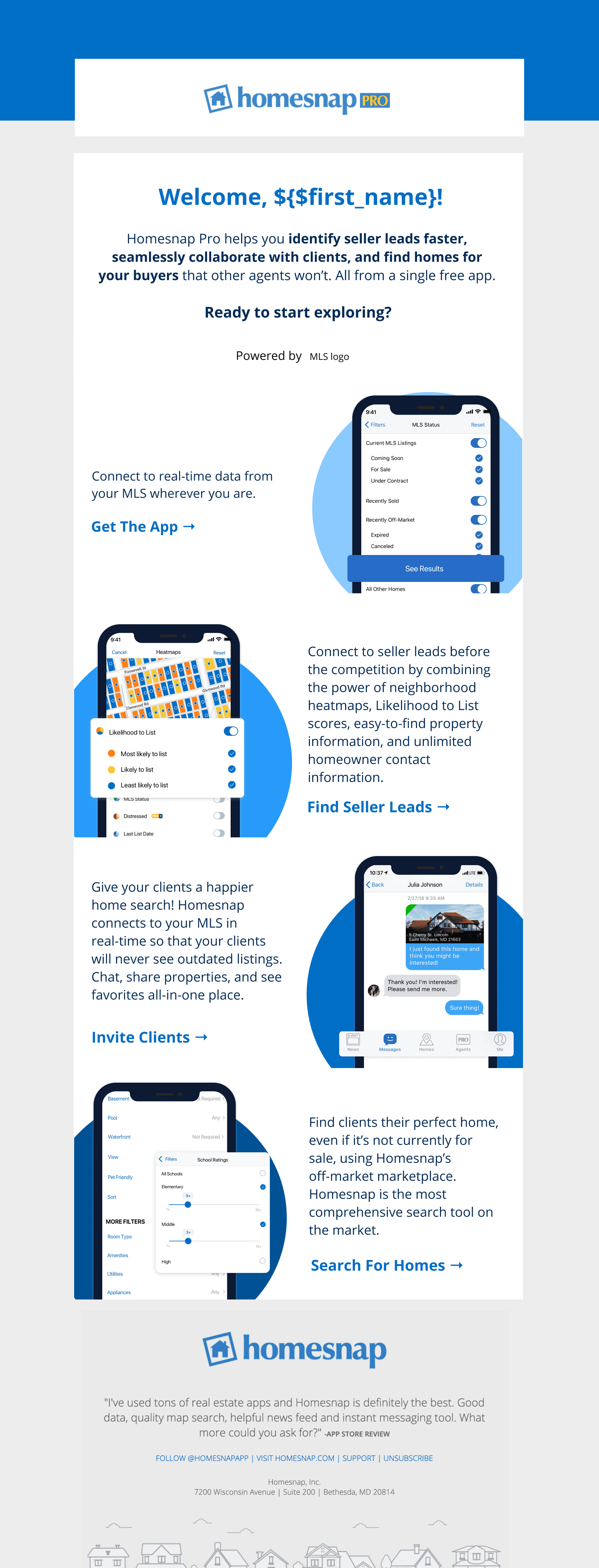
In this project, I also designed marketing emails and banners for the product. And here are some examples: